한글 상상거리: 조치원읍 한글싱싱로
Client
재단법인 세종시문화관광재단
Year
2025
Services
Brand Design Naming&Copywriting Character Design Pop-up Design Goods Design
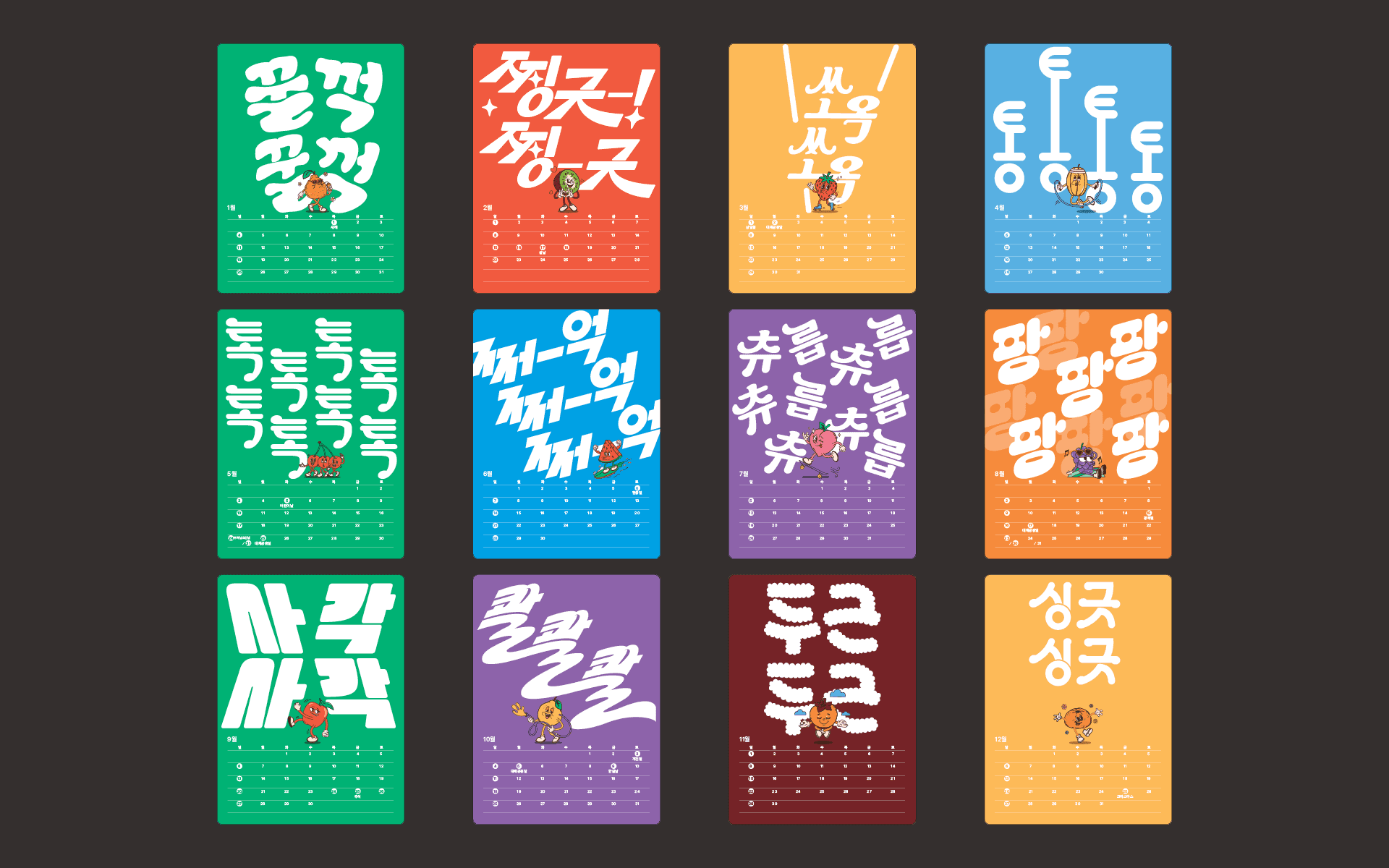
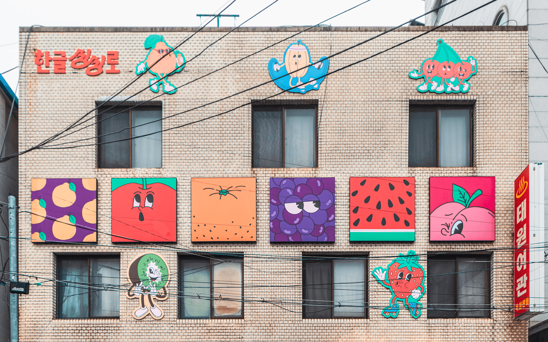
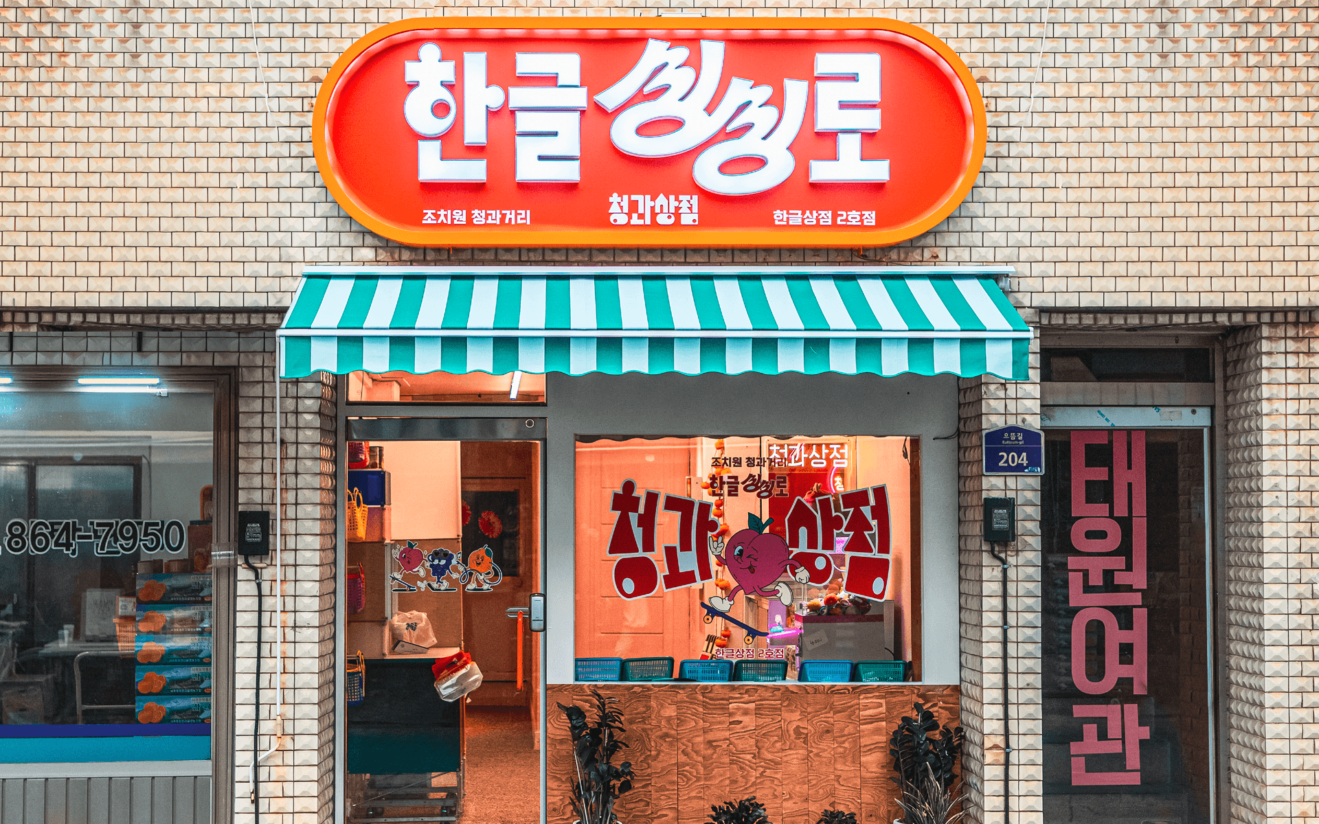
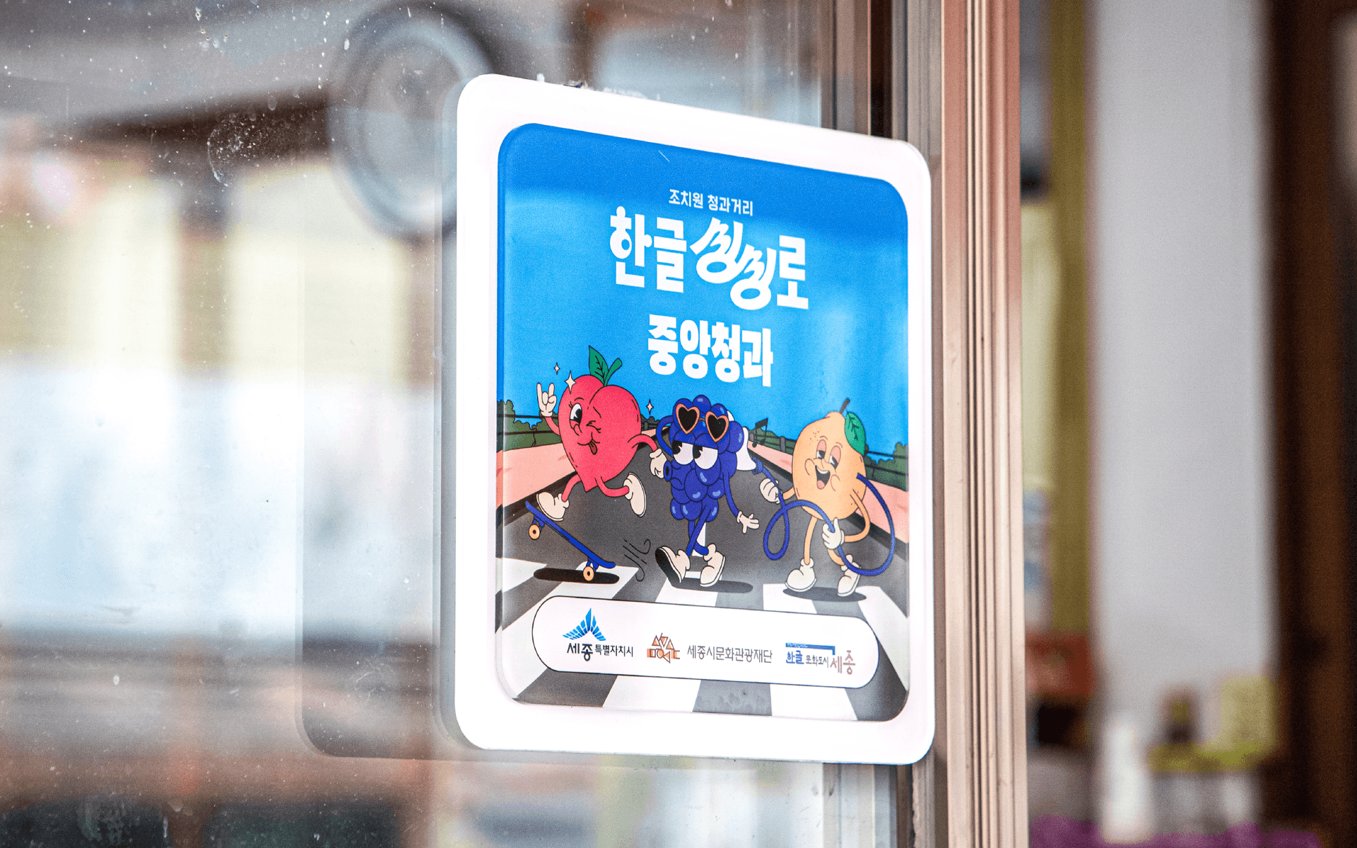
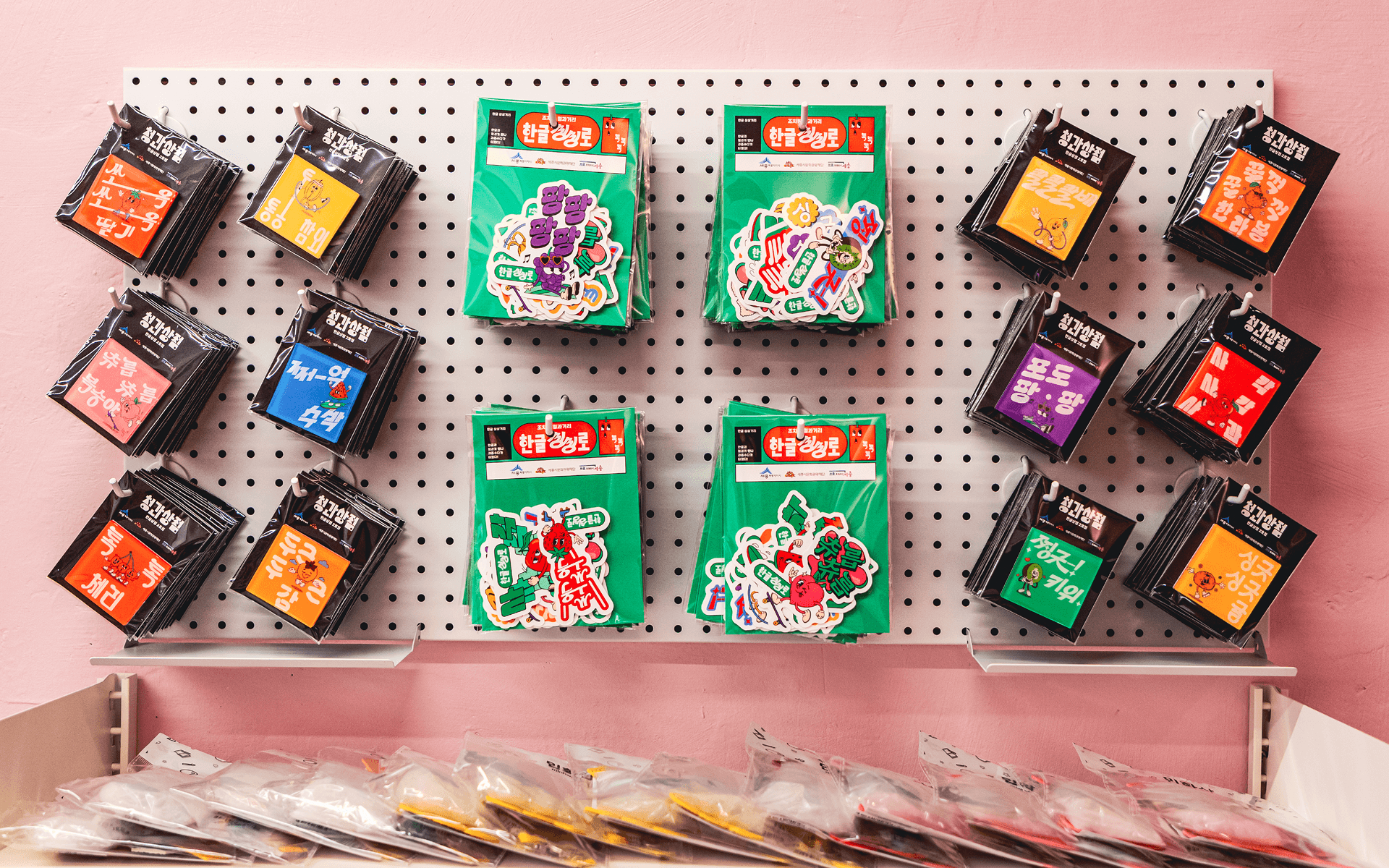
조치원읍 청과거리는 100년이 넘는 시간 동안 지역의 청과 유통을 이어온 역사적인 거리입니다. 우리는 이 오래된 상권을 한글을 통해 새롭게 활성화하는 지역 브랜딩 프로젝트를 기획했습니다. 프로젝트의 출발점은 거리의 정체성을 새롭게 정의하는 것이었습니다. 다른 지역과 차별화되는 이름으로 ‘한글싱싱로’를 제안하고, 이 거리에서 1년 동안 유통되는 대표 제철과일을 한글의 의성어와 의태어로 표현했습니다. 단순히 과일의 정보를 전달하는 방식이 아니라, 과일의 맛과 식감, 계절감을 감각적인 별명으로 만들고 이를 한글 그래픽으로 시각화했습니다. 이를 통해 한글싱싱로는 과일을 판매하는 거리를 넘어, 제철과일을 가장 맛있게 경험하게 하는 거리로 확장되었습니다. 한글은 상권을 장식하는 요소가 아니라, 지역의 역사와 상품의 매력을 연결하고, 거리의 경험을 새롭게 만드는 브랜딩 언어가 되었습니다.
Jochiwon Fruit Street is a historic commercial street that has distributed fresh produce in the region for more than 100 years. We planned this local branding project to revitalize the old market district through Hangeul. The project began by redefining the identity of the street. We named it ‘Hangeul Singsing-ro’, a distinctive name that sets it apart from other commercial areas. For the seasonal fruits distributed along the street throughout the year, we created nicknames inspired by Korean onomatopoeia and mimetic words. Rather than simply describing each fruit, we translated its taste, texture, and seasonality into expressive Hangeul graphics. Through this approach, ‘Hangeul Singsing-ro’ became more than a street that sells fruit. It became a place where seasonal fruits are experienced in their most vivid and appetizing form. Hangeul does not simply decorate the street; it becomes a branding language that connects local history, product appeal, and the sensory experience of the market.